A-Frame by Arc'Teryx
Identity

A-Frame by Arc'Teryx
Naming, Creative Direction, Design,
Identity & Packaging


The Process
Initial Direction: Mountain Huts
Working Title: Hut Magic


The Name
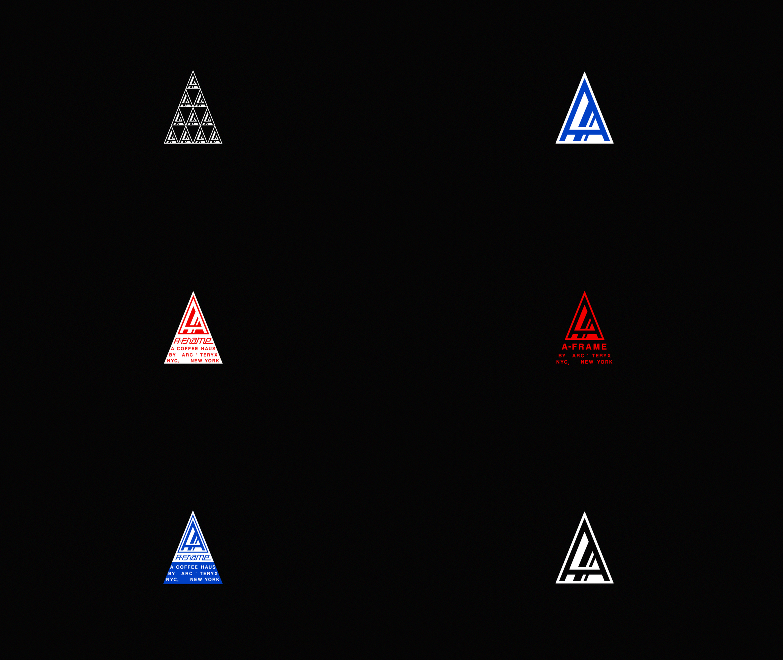
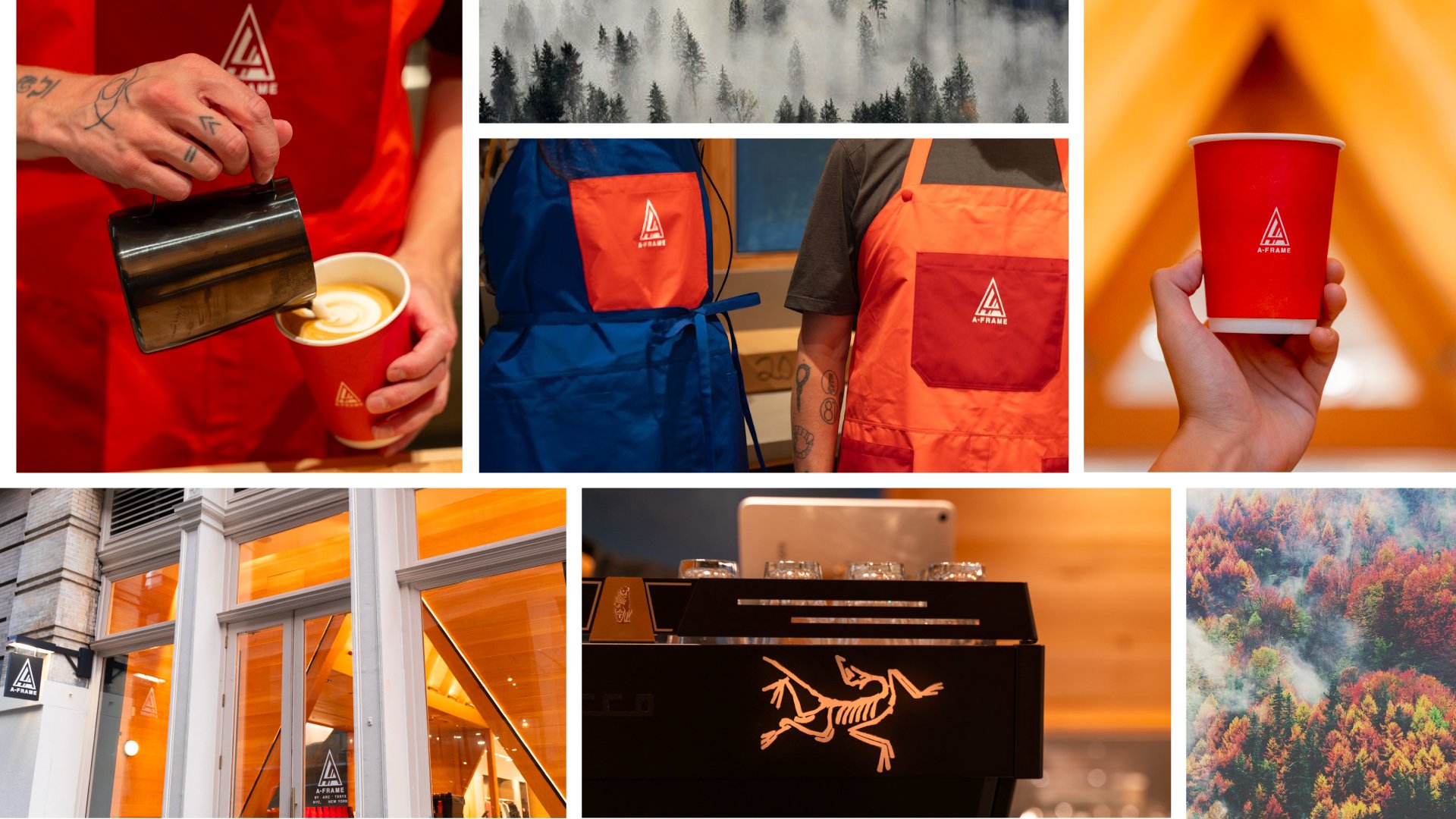
the “A” obviously plays off the first letter of Arc’Teryx and I liked that the triangle shape could become a consistent brand element. It also opened up an exciting opportunity for the environmental design team to design the space as an actual A-Frame structure (Which they did).


